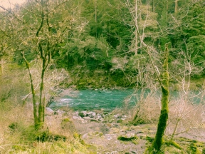
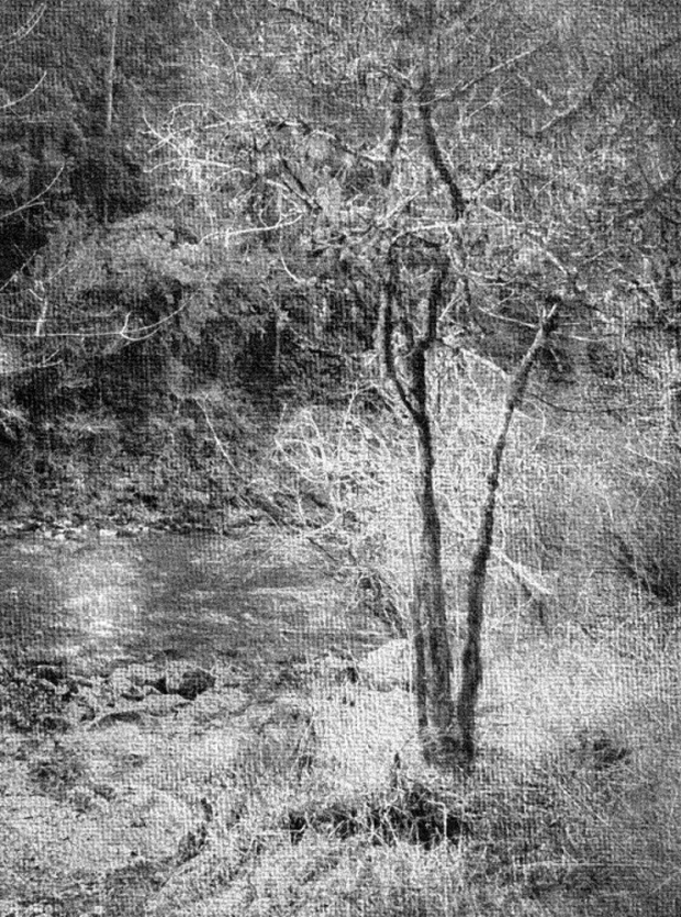
Week 3 is here, I am enjoying working with this image. This week, I wanted to try a black and white image but I went a route I have never done before. I used two different programs to get to this result. I was looking to make a black and white pencil drawing or even charcoal sketch, and I think I may have achieved that (Click on the image for the easiest viewing).
Details:
- Imported my first week’s image into FotoSketcher and used the preset Vintage Photo #1, I messed a bit with the settings to get the look I liked.
- Although I liked the vintage look, it was a little too sepia toned for what I was going for. So, I brought it into Lightroom and started playing with the different presets to see if I could get a better look. I settled on BW look #4
- Then I flipped the image horizontally and cropped it to a vertical image.
- There were a couple of things I needed to do to make this image stand up on its own so I started with a radial filter over the river, it was really light. So I lowered the exposure, added highlights and clarity until I felt it looked more like river waters. I used another radial filter over the water to enhance the highlight of sunlight on the water.
- I used the adjustment brush tool in a couple of places, first the trunks of the tree were only dark at the top of the tree for some reason, so I lowered the exposure on the brush and painted the trunks all the way down so they stood out more. Then I used another brush to highlight the river rocks on the shoreline of the river. The finally adjustment brush was to add highlights to the grasses in the foreground so they weren’t so washed out.
This version is definitely very different from the first two weeks. I am happy with the drawn effect and texture too, like it is drawn on watercolor paper. I am anxious to hear what you think, please feel free to leave feedback or comments. It is how I learn and grow and what I look forward to most about this post each week.
Please check out Robyn’s latest version of her image this week HERE, in the comments of her post you will find other participants links as well. Or use your tag search and look for “One Four Challenge” where you will find everyone’s posts.


I didn’t recognise it from the last two weeks at all at first. The texture is gorgeous- kind of watercolour paper but could also be canvas. It’s definitely more pencil drawing than charcoal because it’s almost impossible to get that kind of detail with charcoal. It is beautiful though 🙂
Okay, good to know. I wasn’t sure which it looked more like. I mostly dabble in painting and color pencils, not straight pencil or charcoal.
Yes, it is very different from the last two weeks, crazy how much an image can change. I am happy you enjoy it, It took more work than I anticipated but I learned a lot, again…so that is what I am most happy about 🙂
Very nice edit, my favourite of the three so far. I love the crop, it gives it a stronger focal point in the foreground tree.
Thank you Katie, I have been searching for a crop I liked, this was my favorite so far. I have never flipped an image until now and I would have never thought of it unless I was looking through others in this challenge and seeing what they did last week. Thanks for you feedback, I really appreciate it.
I like how you cropped the photo giving us a new view of the river and trees … the texture is interesting … and I agree the vintage look was a little too “washed out” black and white was a good choice giving it the “carboncino” drawing effect .. like how you used the brushes to make your adjustments very creative.
Thank you Bastet, I really appreciate that feedback. It was a process for sure 🙂 But, fun to figure out and keep coming back to. I love those brushes! I was rather intimidated by them but feel more comfortable after this week. Thank you again!
I’m still intimidated by them … I really want to take my courage in hand and give it a go!
Oh you should! The best part about them is that you can delete easily. And, you have full control over the part you brush once you have brushed an area. So, I just put the exposure up (nothing else) to see where I am brushing and then mess with the bars after I am done covering an area. It is great, I highly recommend taking the plunge 🙂 You could always “practice” on an image you are not so invested in, to get the hang of it first but I think you will find it fun and addictive!
Thanks for your encouragement Carrie i most certainly will give it a go!
Sure! I think you will be happy you did.
This is a great edit. I think I like everything about it – the crop and flip that shifts the focus to the tree, the watercolour paper / canvas texture and the drawn effect. It looks so very different to the earlier versions. Really well done. 🙂
Thank you! I really appreciate that. I was really excited when I was inspired to try to flip the image after reading another participant’s edit from last week. I was having a hard time finding a good crop for this image. Once that worked the rest fell into place. You just never know where this challenge is going to take you, I love that!
I love mono and the crop and texture is wonderful. It gives it a dreamy wonderland look in this process.
Thank you, Cybele! I really appreciate your feedback. It reminds me a bit of an illustration from an old children’s book. I love those!
me too!
Really nice edits this week. Huge improvement in the picture.
Thank you, I appreciate your feedback 🙂
I really like the composition of the newly cropped image. It really works. You have been very creative and it continues to inspire me.
Oh thank you, that is such a nice compliment. I had fun with this edit. Now…to get inspired for next week.
Have been passing by for days now as I make my way through – hooray for Reader 😃
Couldnt wait to tell you how much I like what you did this week Carrie!
Love that you flipped it, cropped it and made it BW. It suits this so much 😃
You are a real inspiration in your learning and encouraging others. Keep doing it and thanks.
This composition really draws me in – more than before! Great wk 3 😃😃
How nice to hear, Robyn. Thank you! I do like the new crop and it was sure a process, but a good one this week!
I love to encourage and share with others, this challenge is great for that. It is my pleasure. Still stumped for next week. I tried downloading a freeware program to link layers together and ended up with spam all over my computer ;( not cool. So, I took a break in the ideas…I’ll get back to it later today.